The best thank you page examples all do the same four jobs. They confirm what just happened, set expectations (what arrives, when, from whom), get the visitor past the last hurdle, which for an email signup with confirmation is the click in the inbox, and offer exactly one next step. With double opt-in you need two: one before the confirmation click, whose only job is that click, and one after it, the best spot on your site for your next offer. A third page handles expired links.
Below is the signup flow on kevinwelter.com, as far as you can click through it yourself. The site is built and maintained by Ralf, my AI employee for websites (Build and Modernize a Website With AI). Everything on freebies, lead magnets and funnels is collected on Lead Magnets, Freebies and Funnels.
What a thank you page is for: three pages, three goals
The page after the form decides whether a signup turns into a confirmed contact and whether the person takes another step. If your signup sends a confirmation email, plan these three pages separately.
Page
When it appears
Its only goal
Keep off it
"Almost there" page
right after the form is sent
get the person to open their inbox and click the link
offers, share buttons, a second form
Thank you page ("You're subscribed")
after the confirmation click
set expectations, offer one next step
five equally loud buttons
Expired-link page
when the link is old or broken
a way back to the form, no searching
a bare error message
The first page is the one people get wrong: promote the community, the course and the call there, and you distract from the only click that makes the signup count. After confirmation the person has what they came for and is unusually attentive. Legal questions about confirmation emails and consent records are left out here; this is not legal advice. They are covered in Double Opt-In: Email Setup and Legal Basics.
Thank you page design: five building blocks
1. State the status in the headline. "You're subscribed" or "Almost there" tells more than "Thanks!".
2. Set expectations. What comes, when, from whom. Name the sender and the address the email comes from, and the rhythm: right now, tomorrow morning, every week.
3. Help with the hurdle. Every "almost there" page needs the hint to check spam or promotions. Better still, show the address that was entered so a typo stands out, and offer a way back to the form.
4. One next step. One, not five. Which one depends on what the person just got:
Next step
Fits when
Example
Community or course
the freebie raises a problem the community solves
a template for your first AI employee, then the community to build it
Booking a call
the person's answers suggest a conversation makes sense
a quiz result with a booking link only for businesses with a team
A second freebie
you have one that follows on from the first
after prompt templates, a personnel file pack
Sharing
the offer is just as useful to others
a link to forward to a colleague
Reading on
there is nothing to sell yet
the matching guide
5. A way out. Navigation, footer, links to content. A page without a single link is a dead end.
Thank you page examples from kevinwelter.com
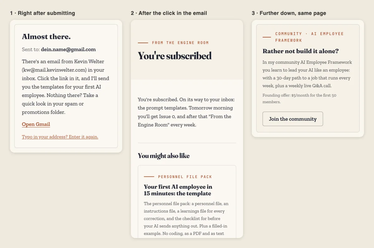
The almost-there state in the box, the thank you page with a second freebie, the community box. Pages and prices as of 06.11.2026. Example address, submission simulated in the test, nothing sent
Right after submitting. Sign up for a template on /en/vorlagen and the box turns into the almost-there page: "Almost there.", then "Sent to:" with your address, the sender with name and address, and the hint to look in spam or promotions. With a Gmail address there is also a direct link to the inbox, "Open Gmail". At the bottom: "Typo in your address? Enter it again." No offer in the box.
After the click in the email. The thank you page first says what happened and what comes next: "You're subscribed. On its way to your inbox: the prompt templates. Tomorrow morning you'll get Issue 0, and after that 'From the Engine Room' every week." That matches section 7.8 of my privacy policy (in German): with a freebie, the welcome email goes out the morning after confirmation. Then comes exactly one second freebie that fits the first; confirm the prompt templates and you are offered the personnel file pack. According to the same section, one click on the button sends the second freebie to the address you just confirmed, without another confirmation email. Below that sits a community box, "Rather not build it alone?", with one button: "Join the community". After a plain newsletter signup, the page mentions the welcome email "with the three rules that apply to all fifteen of my AI employees" instead.
When the link has expired. The expired-link page explains why in one sentence: "Confirmation links are valid for seven days, and this one has expired or is incomplete."
A call only when it fits. On the Bottleneck Check, the result is the page after the action. According to my privacy policy, section 7.9, the result and the email include a booking link only if you say more people than just you work in your business. How the check works as a funnel is in Quiz Funnels: Building One with AI.
What you can copy from this:
Help before confirmation, an offer after it. The almost-there state has no community box; the thank you page does.
The page promises what the email delivers. If it says "tomorrow morning", the email arrives tomorrow morning.
The second offer follows on from the first. A fixed pair per freebie is easy to maintain. Which freebies work as a pair is in Lead Magnet Ideas and How to Test Them.
What to measure on a thank you page
A thank you page answers four questions:
How many signups get confirmed? Count people, not submissions.
Does anyone click the next step? Give the button its own event and its own tag in the link. Since 19 September 2026 I measure, cookie-free, which button on which page gets clicked on kevinwelter.com; the community button on the thank you page carries utm_content=newsletter-bestaetigt in its link. How to build such links is in UTM Parameters: Examples and Common Mistakes.
Which freebie and which placement bring confirmations? My site statistics count both without reference to the person (privacy policy, section 7.8).
What does your ad platform count? Google Ads can count a page load as a conversion without extra code if the Google tag is already on the page, for example with the rule "URL contains" and a fragment like "thank-you". What it counts is the page load, not the signup itself.
That leads to a technical rule: thank you pages stay out of the search index. My status pages carry noindex and are not in the sitemap. Google notes that the rule only works if the page is not blocked in robots.txt, because otherwise the crawler never sees it. How to test a change properly is in Conversion Rate Optimization: Steps and Tests.
Five thank you page mistakes
The dead end. "Thanks for signing up." and nothing else.
Selling before confirmation. An offer on the almost-there page competes with the click in the inbox. As a hypothesis to test: the more you put there, the more likely the key step gets forgotten.
Too many paths. Community, call, course, Instagram and podcast side by side. Pick one main step.
A promise the email breaks. "Arriving now", and the email comes the next day.
The forgotten error case. Expired links land on a generic error page, and the person who wanted in is gone. Give it its own page with the form.
For Ralf, a thank you page is an expansion job: new landing pages and functions get integrated into the existing system. He then checks build, screenshots, mobile layout and click paths, and prepares the launch, while approval stays with me. For landing pages, his rule is that the ad promise, page content and measurement point are set before the build starts.
An example brief: "After the freebie is confirmed, the page should say when the email arrives, show exactly one matching second freebie, and below it the community box with its own tag in the link. Check desktop, mobile and the expired-link case, then prepare the launch." How the page before it is built is in Create a Landing Page: Guide and Tools.
Ralf comes as a ready-made template in the Premium tier of my community for $149 a month; in Standard, at $5 a month, you build him yourself (as of October 29, 2026, according to his page).
Frequently asked questions
What is a thank you page?
The page shown after a form is submitted, also called a confirmation page. It confirms the action, says what comes next and offers one next step.
What should a newsletter thank you page include?
Before the confirmation click: the prompt to open the email, the sender, the spam hint and the address entered. After the click: that the signup is complete, when the first email arrives, and a single next step.
Should a thank you page be indexed by Google?
No. It only makes sense after an action, and every stray visit skews your counts. Use noindex and leave it out of the sitemap, without blocking it in robots.txt.
Can I sell on a thank you page?
After confirmation, yes; it is the best spot for it. Before confirmation, any offer pulls attention from the click in the inbox.
How do I know if my thank you page works?
Count confirmed people per signup and clicks on the next step. Change one thing at a time and measure again.
Where to go from here
Grab a template on /en/vorlagen and see the three steps from the inside: almost-there state, email, thank you page with a second freebie. Then check your own against the five building blocks. If you'd rather not build it yourself, see how Ralf works; Ralf and the other ready-made AI employees are available to load in my community AI Employee Framework. For a project of your own, get in touch. What comes before the thank you page is in How to Create a Lead Magnet (8 Real Examples).
Kevin Welter
Developer, IT architect, author of technical books (Kubernetes, cloud infrastructures) and speaker. Runs his business with an AI workforce of fifteen AI employees and shows solo business owners in his community how to hire their first AI employee.